Monday, 22 October 2012

Group: Pitch feedback

Our concept change from an animal escaping captivity to a prisoner escaping and seeing his family again was not received well from the class, they preferred our original idea.

Issues raised included:
  • The age of the prisoner's children would be a difficulty since our prisoner would need to look older than he would in real life.
  • It was also pointed out that we would need to consider how our character switches to and from locations.
  • Although Hayesden Park looked nice when we were there for our location reccie, the weather may not be as good when it comes round to filming.
  • Is our planned ending at the prisoner's home exciting enough? Or is it an anti-climax?
  • Miss Johnson thinks that for us to use an orange prisoner suit would make our music video too similar to another video from a previous year.
  • If we switch back to an animal idea we will most likely use a crocodile suit, which we need to look at the price of.
  • We also need to figure out what to fill time with. What actions other than running will the character be doing?
  • What is going to be happening during the character's journey.

Sunday, 21 October 2012

Wednesday, 17 October 2012

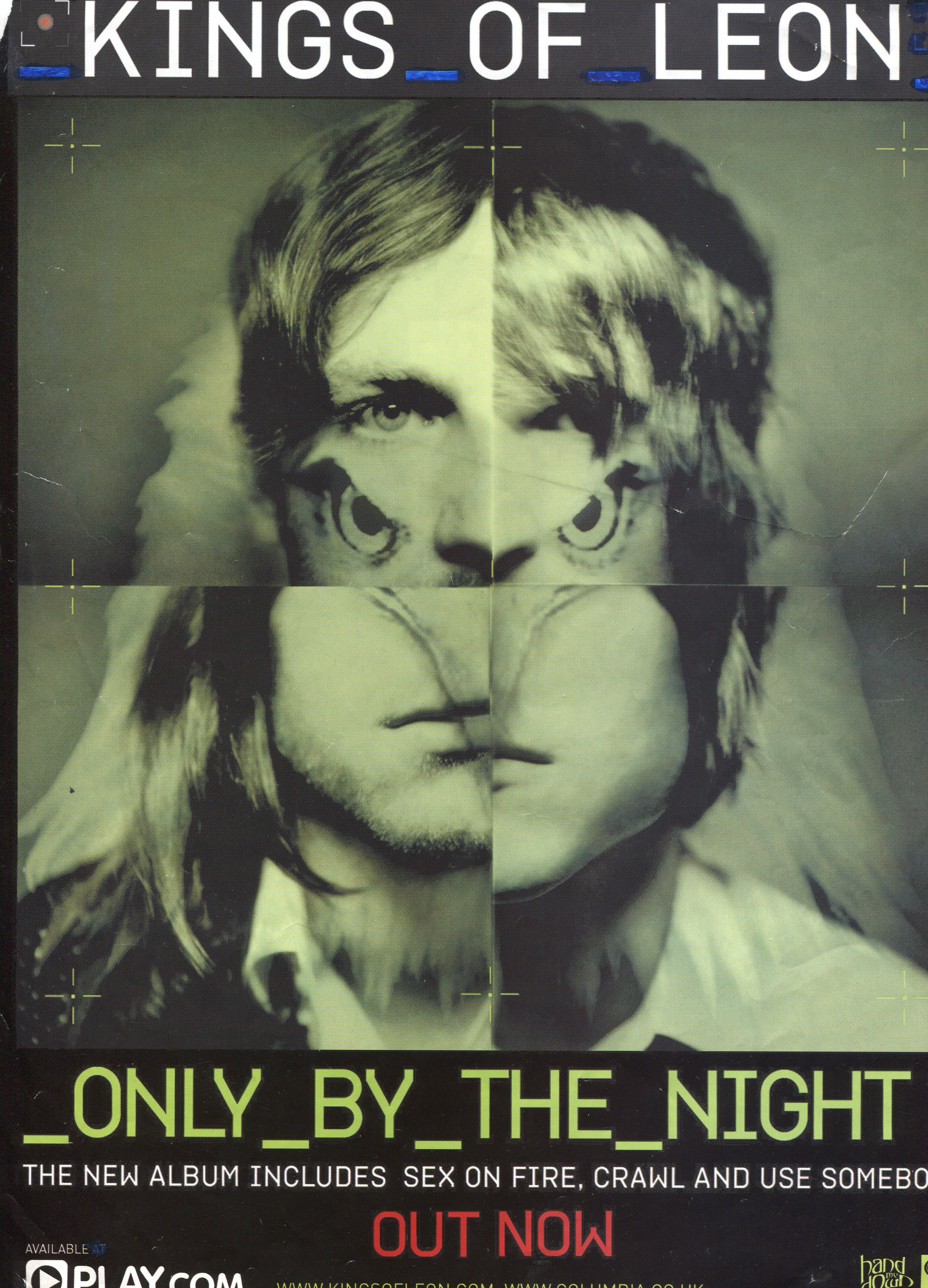
BW: Print analysis - advertisement

  • Kings of Leon are an alternative/indie rock band and the genre is evident through the disjunctive appearance of the band in the advertisement. 
  • The alternative/indie rock genre is about establishing the uniqueness of the band and so there is an eagle's head mixed in with the picture. 
  • This helps to promote the individual image of the band because the reasons for the eagle head being there are mysterious. Kings of Leon may wish to appear minimalistic and entirely focused on making good music, much like many alternative/indie rock bands would describe themselves. This may be interpreted from the dull and rather desaturated texture of the advertisement.
  • This advertisement makes full use of the rule of the thirds which you can tell by how your eyes are drawn towards the top pair of eyes. This is perhaps used to make the band much more recognisable since the audience are focusing on the bands' eyes more.
  • The colouring of the advertisement is very dull which helps to bring more attention to the album title that is printed in bright yellow.
  • The only linguistic devices used are the use of capital letters such as "KINGS OF LEON" and "OUT NOW" to perhaps create a sense of great importance making the product seem valuable or desirable.
  • The bland tone of the advertisement coupled with the eagle may create two contrasting, but intended, effects because the colouring and the eagle can be used to indicate the sort of music one would expect to find in the album.
  • The dingy green colouring of the advertisement may suggest some slow paced, subdued, and moderate songs but on the other hand, the fearsome looking eagle may be connoting more wild, fast paced songs.
  • In this advertisement Kings of Leon are shown to be quite enigmatic with the eagle head mixed in with the bands' faces. In countries such as the United States the eagle is seen as a symbol of power and this symbolism may have been used to bolster the band's meta-narrative by making them seem more impressive. Making something seem impressive is an effective way of selling a prodcut as the consumer will be more inclined to purchase something they're impressed by.
  • This print text will probably, by most people, be consumed through ambient viewing as readers flick through music magazines. However for those that will pay attention to the advert will consume it through focused viewing.
  • Due to the way the advertisement is constructed, the audiences' eyes will be drawn first to the album name, 'Only By The Night', rather than the band name. This is because the album name is written in yellow which makes a welcoming contrast against the otherwise dull colours.

TF: Print Analysis - Advertisement

I have chosen to analyse this poster from Foster the People, as they are a band in the same genre to ours.


The genre of Indie Pop as a whole can be seen as simplistic, and this is the perfect example of it. Foster the People can be seen as very simplistic, just from their videos and songs, so the band are represented just through this advertisement. Instead of just having a picture of themselves, which is very common of the Pop Genre, they show an unclear image of the Band Name. This poster in fact represents our band ‘Architecture in Helsinki’ perfectly as in many of their videos, there is a strong presence of the dull colours blue, grey and white. It is very hard to draw what exactly is happening in the picture, which has a relationship with the genre, as many videos of this genre have a disjunctive narrative towards them.

Grey, blue, and white are the prevalent colours in the poster, which connote the simplistic notion from which the genre presents. The poster looks very grainy, and rough to once again have a disjunctive meaning to it. Roland Barthes framework referred to semiotics (icons which create meaning in texts), very common in Coldplay’s Mylo Xyloto Album. What I draw from the image is that it is almost being hung-up as if it was hanging from a washing line. And,  as it is Foster the People, I believe its referring to the word ‘foster’, as if kids are almost lined up to be fostered. The image is in the centre of the poster to grab the audiences attention straight away instead of using the rule of thirds technique.

Foster the People are known for their narrative, laid back music, and with the bland colours mentioned, it adds to their meta-narrative, as you can tell the type of the music they play from just the poster.  There is minimal text on the poster and the only details are the bare necessary. Therefore by having this, the audience can easily remember about this poster as it doesn't have any pointless information. The amount of text also emphasises the meta narrative of the genre due to the simplicity of Foster the People as a band.

Tuesday, 16 October 2012

JP: Digipak Deconstruction

Coldplay - Viva La Vida


  • The indie/alternative genre of the album is evident from the digipak. The front cover shows a traditional style painting, possibly from the civil war or surrounding eras. The album name, 'Viva La Vida', is splattered over the top of the painting in white paint. The kind of dull colours and themes displayed on this cover and the inside covers are quite common features of indie and alternative albums, and so we relate these colours with the genres.
  • The visual techniques used in the digipak are mainly colour and tone related. All three covers with text have the text centralised rather than applying the rule of thirds. The splitscreen cover has the band members centralised in their individual pictures as well, so the rule of thirds does not apply to this digipak whatsoever. 
  • The subtle tone and bland colours displayed on the digipak are trademarks of Coldplay, who are known for some of their slow, relaxing music, which could be related to traditional art and subtle tones, which are evident on the digipak. The mise-en-scene on the digipak is sparse, with the only photographs quite difficult to make out, with the only real subject being the artists face, and in one of the pictures, his guitar. The band members are all wearing bland white shirts with black waistcoats or dark coloured coats.
  • Viva la vida literally translates as 'live the life' in Spanish. This has many positive connotations, which is showing that Coldplay's music is generally happy, despite it's slow and bland nature that is often evident. This is the only linguistic device used, as due to the simplistic and subtle nature of the digipak, there is the minimum amount of text required, with track listing, band name, album name, and other necessary details in small print.
  • The only real reference to culture in the digipak is the civil war era painting, a symbol of more upper class or arty audiences. This immediately rules out a large audience from choosing to buy this album, and this therefore means that Coldplay are aiming for a select target audience. 
  • The band's image is reinforced with this digipak, as Coldplay are widely described as being very arty and traditional, and this album is supporting this star image that they have created for themselves by making their digipak very simple and artistic. This does help sell their products, as it makes their albums very recognisable as being theirs, so their target audience finds them easily in stores, and also it means they can display albums as a kind of decoration around their house, as it is quite arty, and people will know they are Coldplay fans.
  • This print text will mainly be consumed by a very focused audience, and not ambient at all, because it is quite subtle and if displayed amongst a group of other digipaks or CD cases, it will go unnoticed unless it is being looked for, and I believe this subtle, artistic look is exactly what Coldplay intend to do.

Friday, 12 October 2012

Group: Storyboard

The shots below are not the only shots we are performing, and they will not be put together all next to each other. For example, shot number 1 would be at the beginning, shot number 5 somewhere in the middle of the song, and shot number 9 somewhere near the end.

Shot number 1


Shot number 2


Shot number 3


Shot number 4


Shot number 5


Shot number 6


Shot number 7


Shot number 8


Shot number 9


Group: Location Reccie

On Saturday 13th October we will be doing a location reccie at Hayesden Park just outside Tonbridge. We will be meeting outside West Kent College at around 2pm. The whole group will be taking part in this location reccie and we will be walking to the park which may provide some nice photo opportunities.  


Countryside where the character may run through


Possible long shot of man running across bridge


Pillbox to be used as the prison


Pillbox to be used as the prison