BW: Print analysis - advertisement
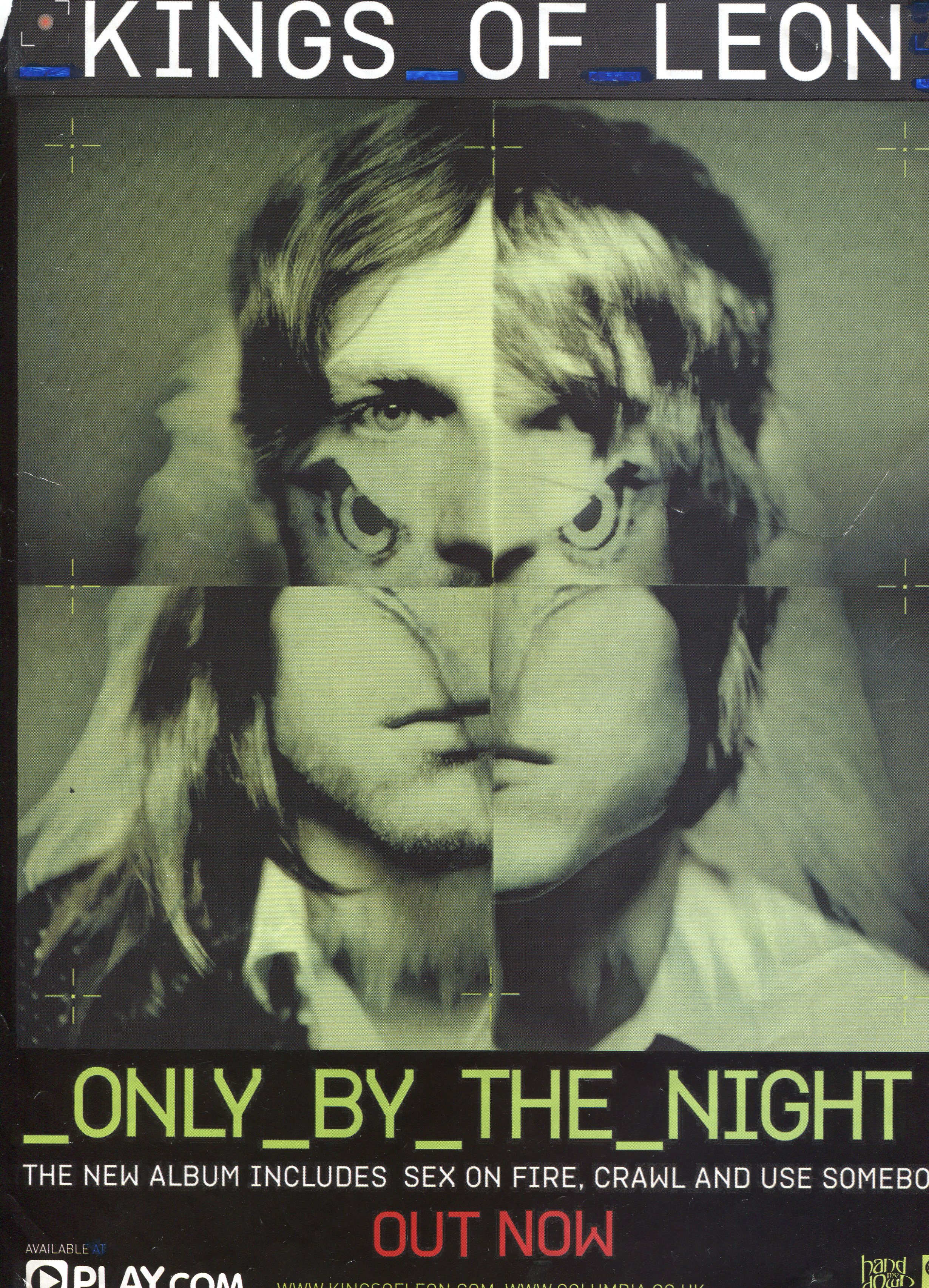
- Kings of Leon are an alternative/indie rock band and the genre is evident through the disjunctive appearance of the band in the advertisement.
- The alternative/indie rock genre is about establishing the uniqueness of the band and so there is an eagle's head mixed in with the picture.
- This helps to promote the individual image of the band because the reasons for the eagle head being there are mysterious. Kings of Leon may wish to appear minimalistic and entirely focused on making good music, much like many alternative/indie rock bands would describe themselves. This may be interpreted from the dull and rather desaturated texture of the advertisement.
- This advertisement makes full use of the rule of the thirds which you can tell by how your eyes are drawn towards the top pair of eyes. This is perhaps used to make the band much more recognisable since the audience are focusing on the bands' eyes more.
- The colouring of the advertisement is very dull which helps to bring more attention to the album title that is printed in bright yellow.
- The only linguistic devices used are the use of capital letters such as "KINGS OF LEON" and "OUT NOW" to perhaps create a sense of great importance making the product seem valuable or desirable.
- The bland tone of the advertisement coupled with the eagle may create two contrasting, but intended, effects because the colouring and the eagle can be used to indicate the sort of music one would expect to find in the album.
- The dingy green colouring of the advertisement may suggest some slow paced, subdued, and moderate songs but on the other hand, the fearsome looking eagle may be connoting more wild, fast paced songs.
- In this advertisement Kings of Leon are shown to be quite enigmatic with the eagle head mixed in with the bands' faces. In countries such as the United States the eagle is seen as a symbol of power and this symbolism may have been used to bolster the band's meta-narrative by making them seem more impressive. Making something seem impressive is an effective way of selling a prodcut as the consumer will be more inclined to purchase something they're impressed by.
- This print text will probably, by most people, be consumed through ambient viewing as readers flick through music magazines. However for those that will pay attention to the advert will consume it through focused viewing.
- Due to the way the advertisement is constructed, the audiences' eyes will be drawn first to the album name, 'Only By The Night', rather than the band name. This is because the album name is written in yellow which makes a welcoming contrast against the otherwise dull colours.
Well done Ben, some strong analysis, take out the word 'boring' and put in the words desaturated and manipulated (where you think they should go)
ReplyDeletelevel 4 analysis
I've changed the word 'boring' and I've now altered it into a bullet point layout.
ReplyDelete